Five projects. Billions of users. Hard problems.
Led the UX for Answers — the fast-answer layer behind queries like "What's the weather today?" and "How tall is Mount Everest?". At peak, Answers handled over a billion queries a day.
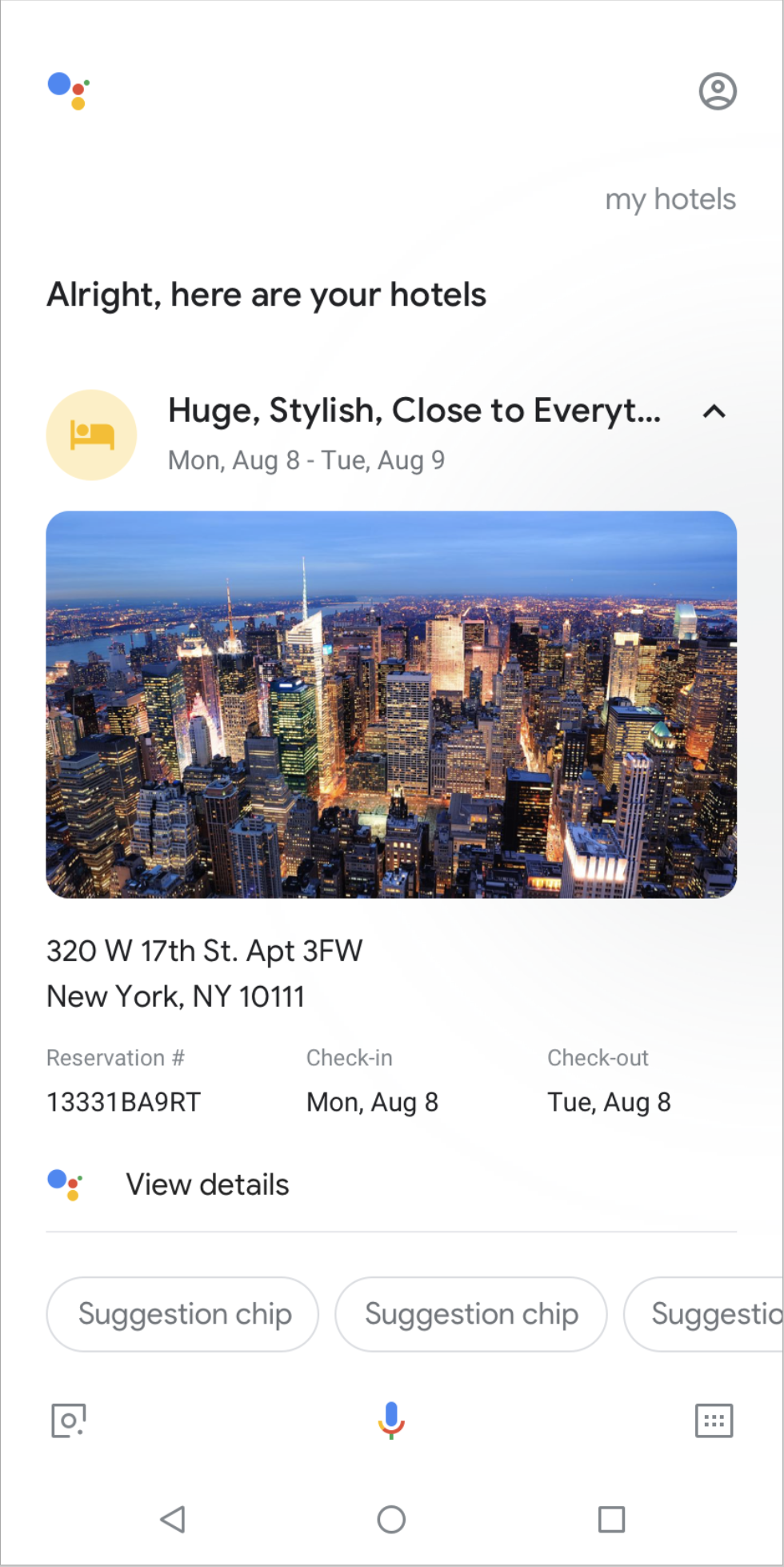
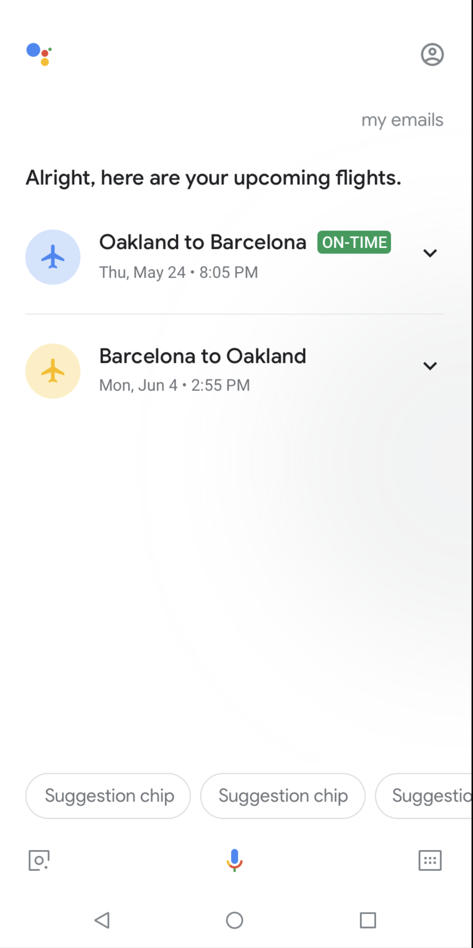
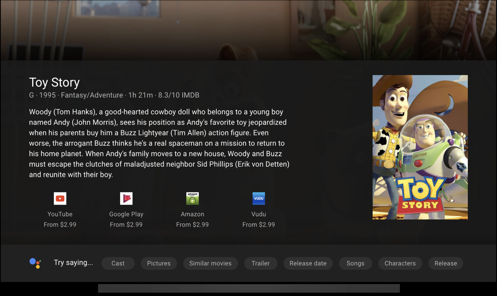
The real design breakthrough was the template system. Instead of building separately for each surface, I designed a shared template framework that let any Google team build an answer once and have it render correctly everywhere — Search, Google Assistant, Google TV, Google Home. The constraint of serving four radically different form factors forced a level of design abstraction that made the whole ecosystem more coherent.
I also worked on the Assistant voice and WaveNet — the first AI-generated voice, and the moment synthetic speech stopped sounding assembled and started sounding human.
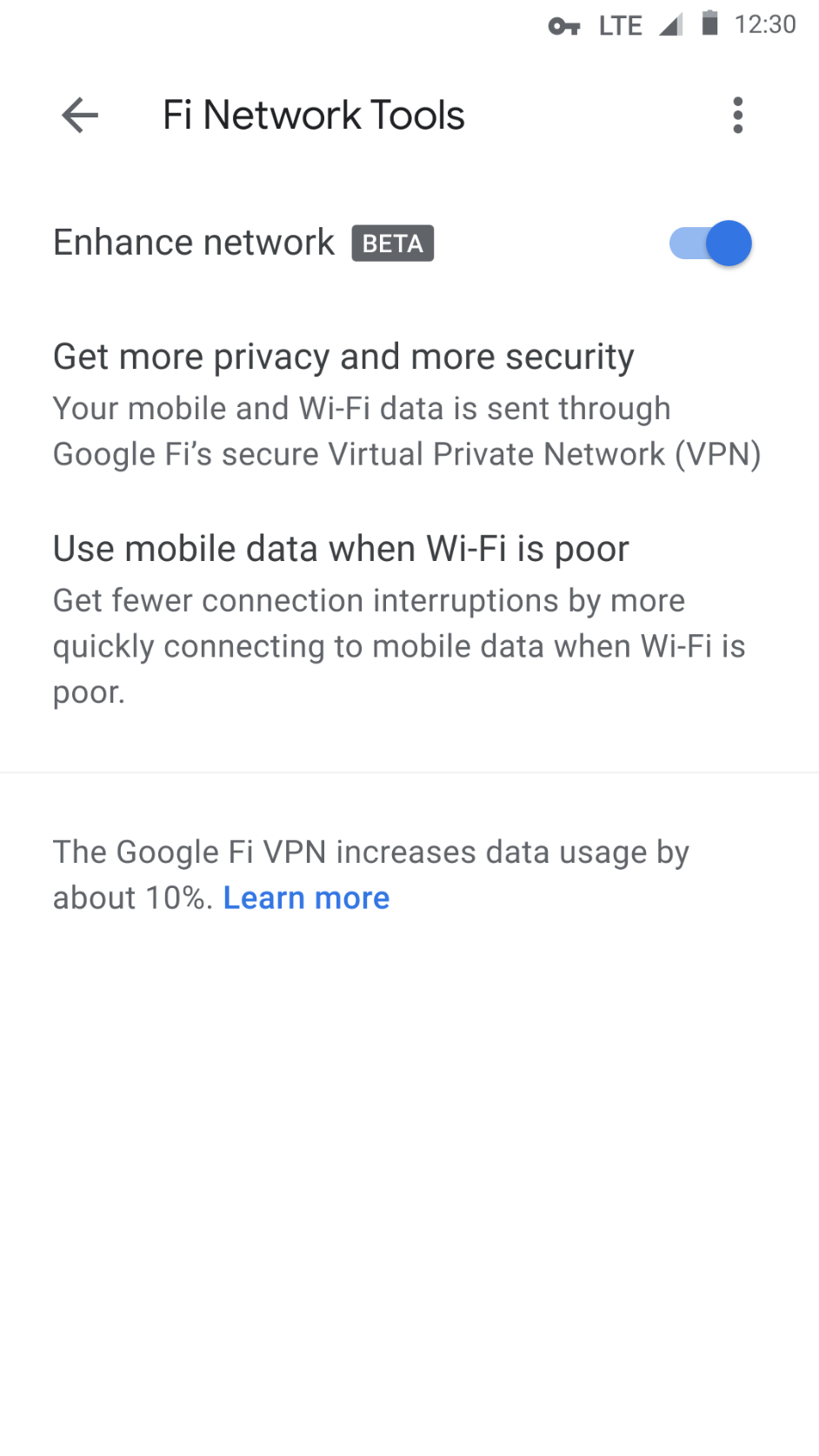
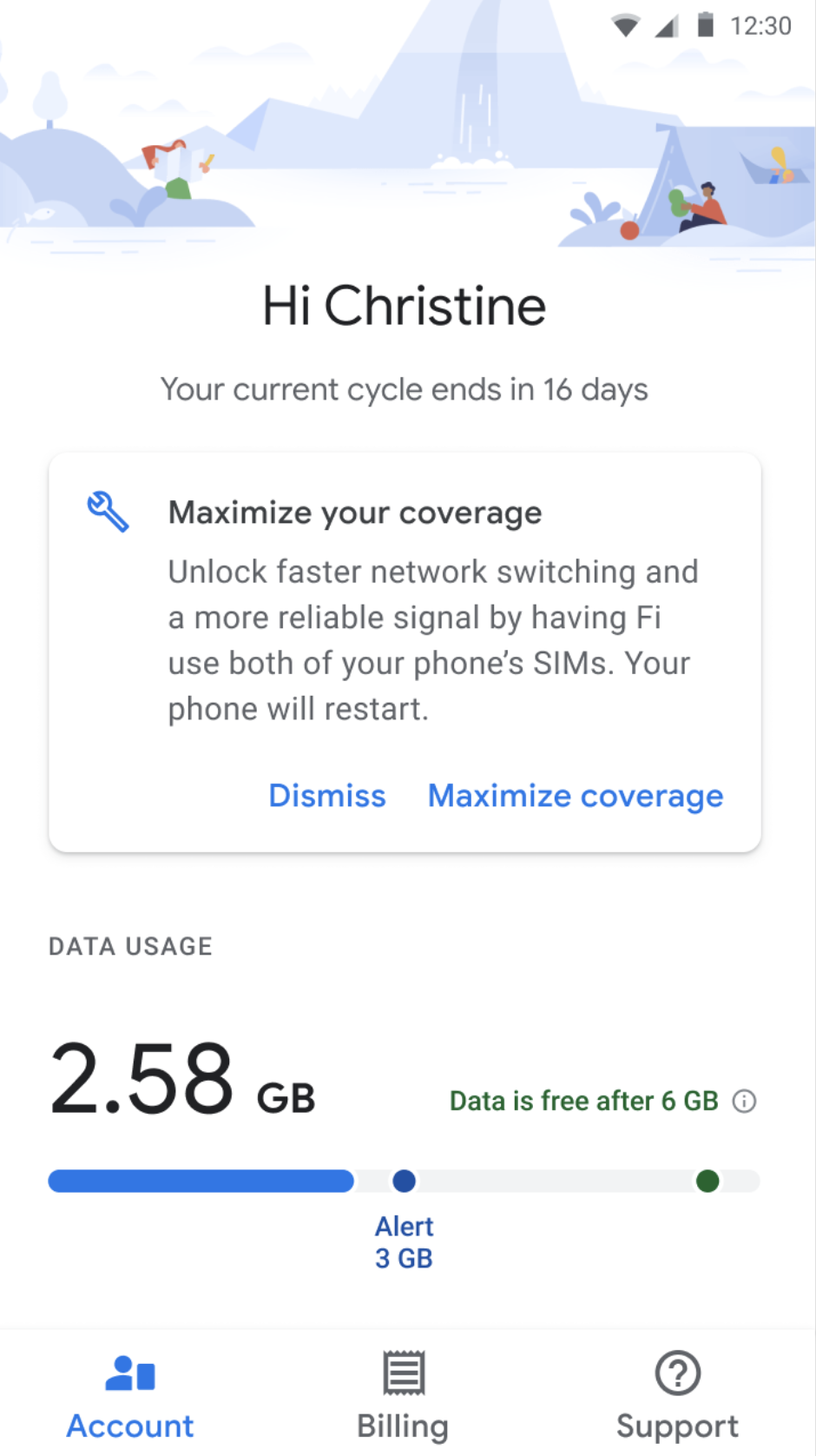
Fi's core idea was audacious: take three separate cell networks — T-Mobile, Sprint, and US Cellular — and stitch them together into one seamless experience. Your phone would silently switch to the strongest signal at any moment, with no perceptible handoff. Designing that invisibility was the job.
We didn't stop at cell towers. The connectivity vision expanded to include WiFi hotspots, LinkNYC kiosks, and a long-range research agenda that explored satellite networks, small cell infrastructure, and 5G. The design challenge across all of it was the same: make something technically complex feel like it just works. The patents came from solving the moments where it didn't.
Designed in response to the European Commission's antitrust ruling on Google Shopping — one of the largest tech enforcement actions in EU history. The EC mandated equal treatment of rival comparison services, which made for a genuinely new design problem: showing competitors inside Google's own product, and doing it well.
The brief wasn't "make this delightful" — it was a legal order. Every pattern had to be defensible to regulators, fair to merchants, and still genuinely useful to shoppers, three groups with very different incentives. Getting all three to hold at once is the most interesting constraint I've ever designed inside, and it taught me how to find the answer everyone can stand behind and make it feel inevitable.
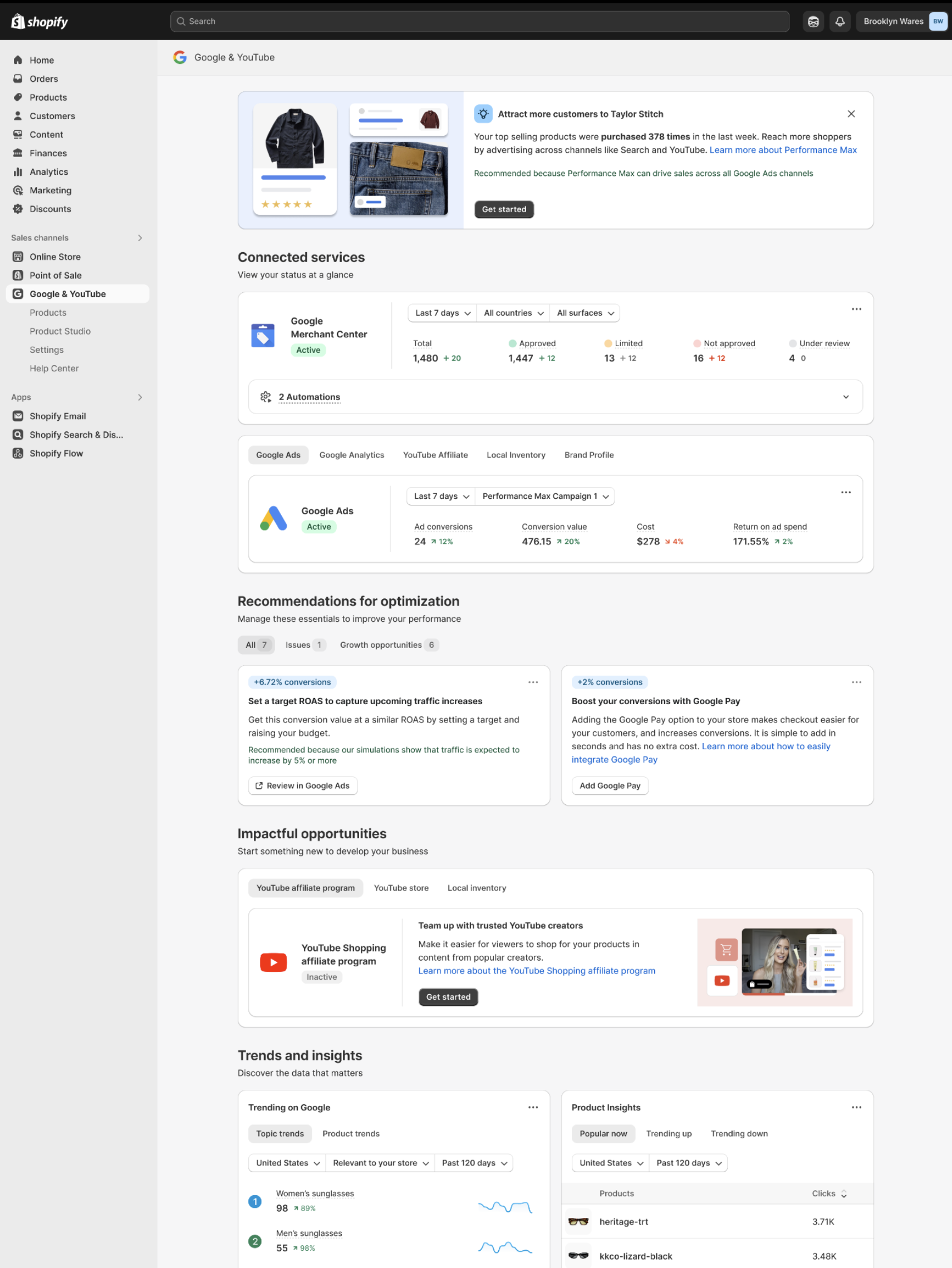
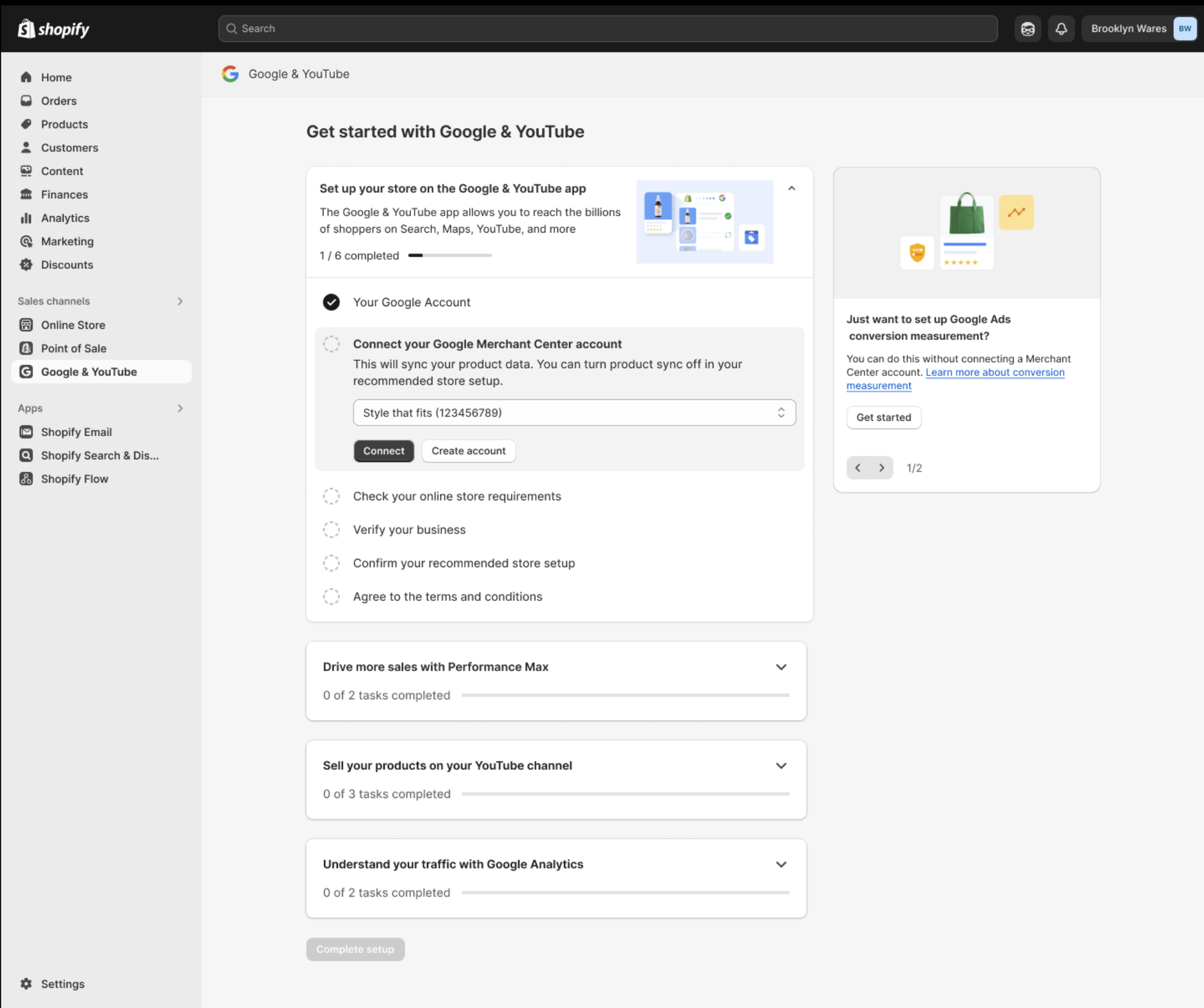
Led the design for Google Shopping's most important integration — the Shopify partnership. The numbers are staggering: tens of billions in GMV, billions in revenue, and millions of merchants onboarded into Google's commerce ecosystem.
The design challenge was operating at two scales simultaneously — crafting a merchant onboarding experience that felt simple for an individual seller, while building the integration architecture that could absorb millions of them without breaking. This was the Shopping org's flagship bet, and the UX had to match that ambition.
AI is rewriting what a shopping interface even is. I'm leading UX for the next generation of Google Shopping — designing for a world where agents browse, evaluate, and transact on behalf of users, and where merchants need to be represented in that loop.
The work spans three interconnected bets. UCP — the universal commerce protocol that makes cart and checkout portable across the web, so a transaction can complete wherever the shopper already is. AI commerce partnerships that connect Google Shopping to the assistants and agents where product discovery is increasingly starting. And AI merchant tools that let sellers represent their catalog, pricing, and policies inside a loop no human is watching in real time. The design problem is fundamentally new — most existing UX patterns assume a human in the loop. Most of the work is unannounced; the protocol behind it is open at ucp.dev.